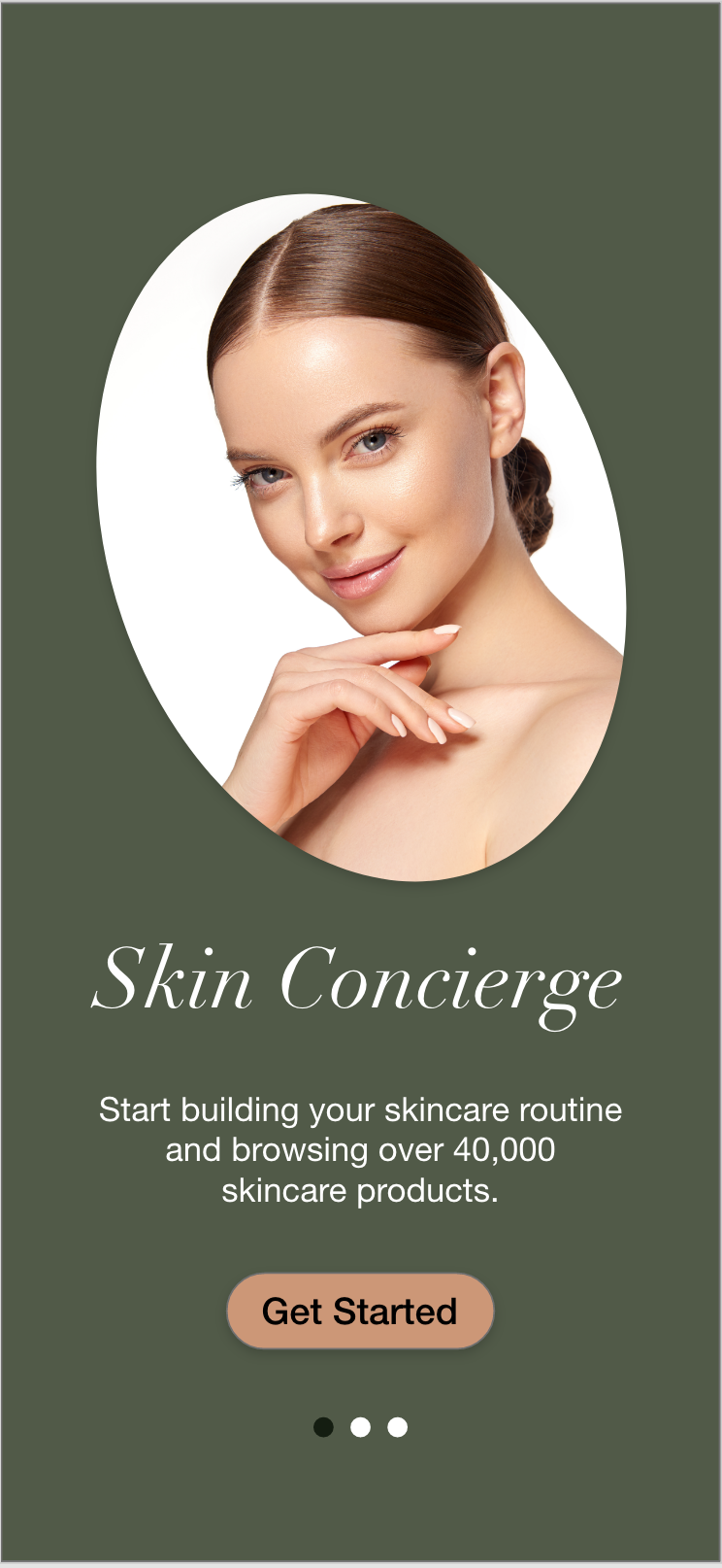
Skin Concierge
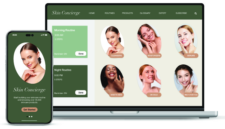
Skin Concierge is a case study i did as part of an Online UX course i completed in 2022. As someone getting closer to 30 in age i realized i needed to start taking care of my skin so i can avoid early signs of aging and also keep my skin looking young, healthy and fresh. The issue was that just like most people i had no idea what i needed to do or use to take care of my skin. I didn’t have a skincare routine, i didn’t know who to talk to about my skins conditions and i didn’t know what products i could use. That is how Skin Concierge was born. I wanted one app, that is easy to use and solves all your skins problems. i wanted it to be a place you can start to explore skincare or you could use to keep track of your skincare journey. i wanted it to be a place you can seek help, buy products and keep track of your progress. I wanted it to be a lifestyle that the app helps you adopt. My role:UX/UI Designer. Tools: Adobe XD and Figma Duration: 4 months.
The Process
Market Research
Since i didnt know much about skincare if was almost natural and essential that i conduct some market Research. I wanted to research skincare apps that already exist. I wanted to see what features are already available in those apps and what features they lack. I downloaded several skincare apps that were the most popular on the app store/ social media and began using them regularly to see what they offered. This helped me understand what was already out there and what i could use to my advantage and either build upon, introduce or completely get rid of in my own app.
User Research: Survey
Next, i wanted to develop my target audience. How am i designing for? who will use this app? why will they use it and what would they want to features do they want in this app. I conducted a survey with around 10 participants. The goal of the survey was to understand the user behaviour around skincare and skincare routines and to find out what tasks they would like to complete in the app. I wanted to document user pain points and understand what makes a skincare app successful.
User Research: User Interviews
I then conducted interviews with potential users. The goal of the interview was to get up close and personal with the users so i could really understand their reasons for their choices regarding the skincare app. i wanted to note what makes them happy, what confuses them or aggravates them. What causes them to stop using an app or get totally addicted to using one. I wanted to understand why they would use a skincare app and what they would be hoping to get out of it. I wanted to know what would be their ideal version of a skincare app or what they feel should be in one for them be 100% use it regularly. i wanted them to tell me what features they wanted in a skincare app or features they think are completely unnecessary to include in the app.
User Research Analysis
All the feedback from the research helped me reach this conclusion: Users want an app that is simply and easy to use with only a few features that are extremely detailed/ helpful. They wanted an app that tells them exactly what their skin needs in order to get healthy. They wanted an app that correctly diagnoses their skin type and their skins conditions, an app that tells them exactly what products to use, when to use them and a step but step of how to use them. They wanted to be able to talk to a skincare expert for more help and they wanted to be able to buy recommended products directly from the app.
User Personas
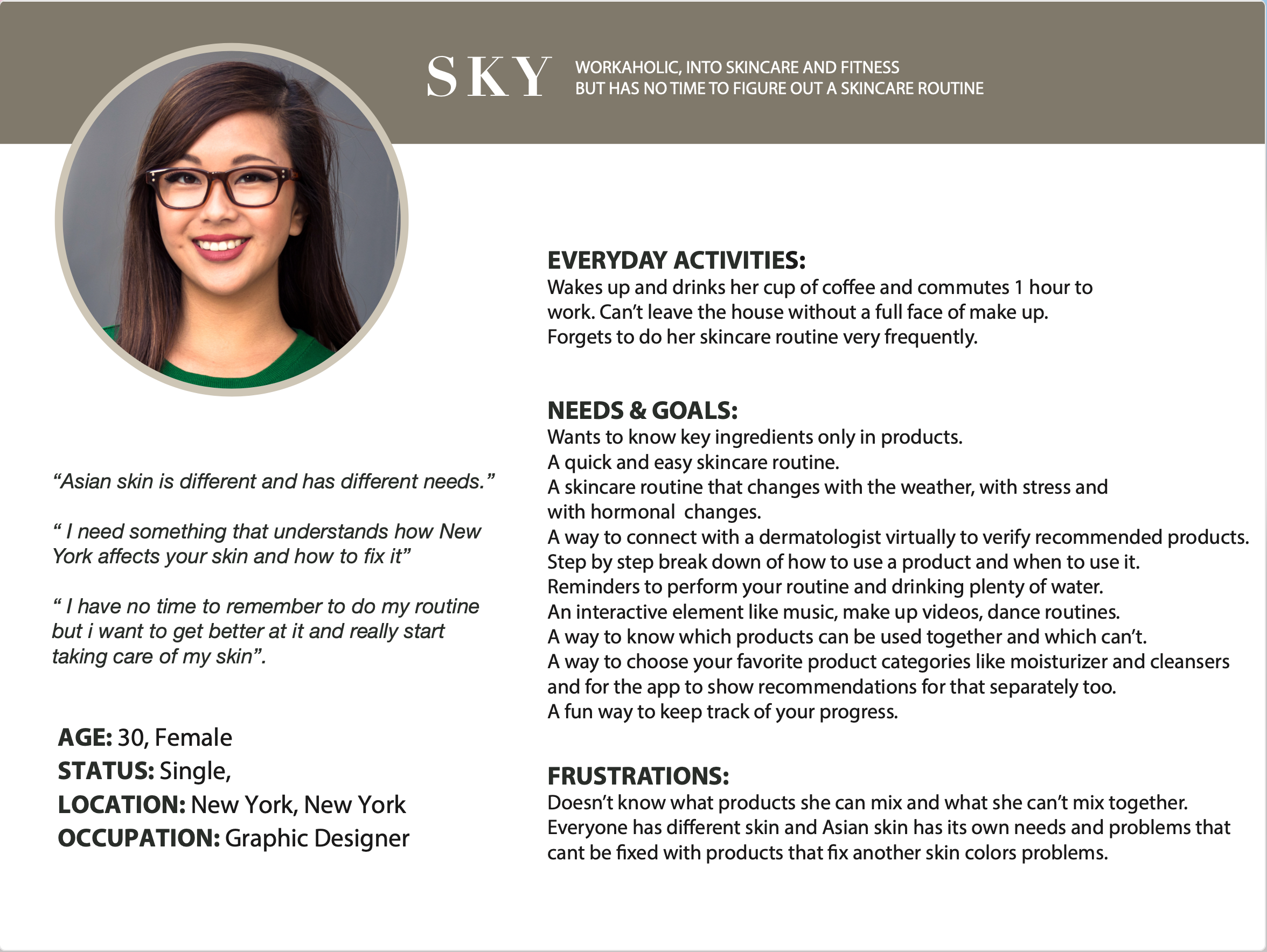
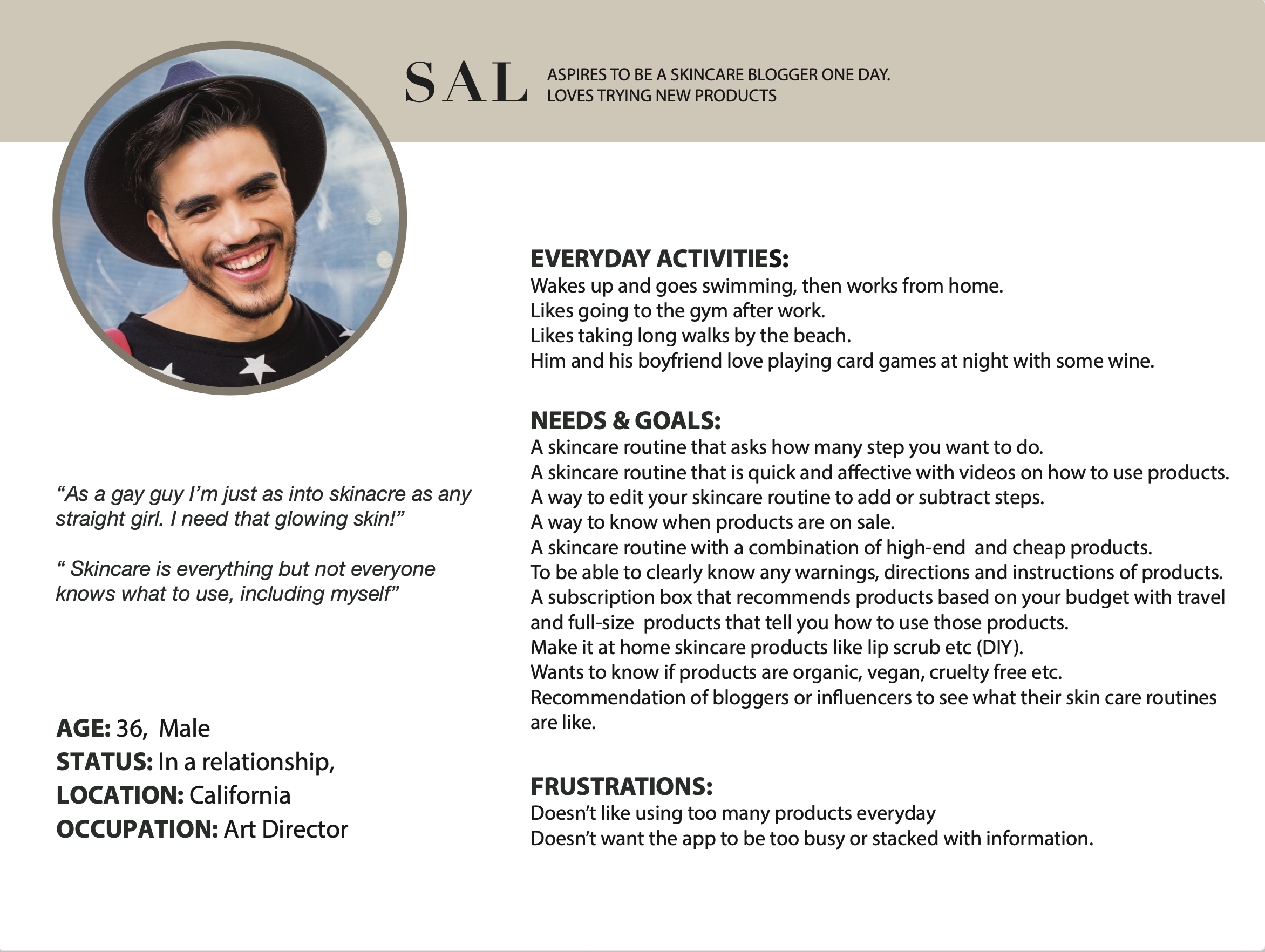
Based on the information i gathered through the surveys and interviews i created two user personas to develop empathy with the users. This would help me make informed design decisions and keep me on track to make sure all the essential tasks are created within the app. Both personas requested different tasks with a few overlaps and so i knew i need to put my thinking cap on to see how i can incorporate both their needs without losing either of them as my users.
Mental Models and User Journey
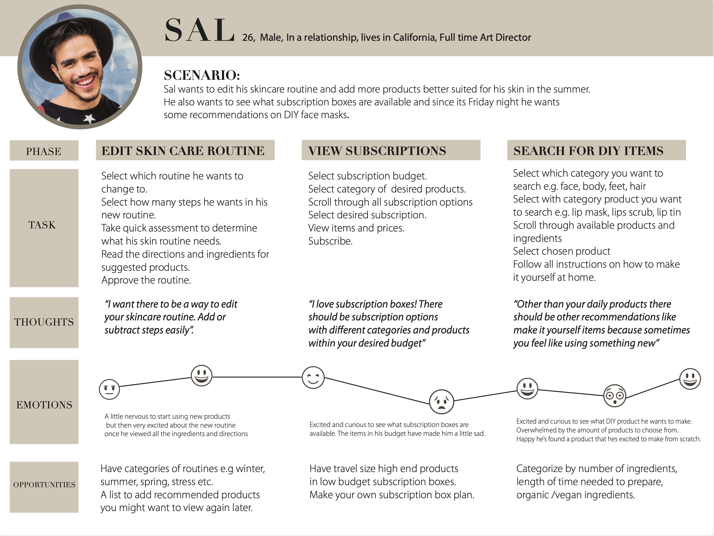
Now i needed to build upon the features that my personas requested and so i build mental models and user journeys to understand how my personas would react/feel about every desired tasks. This would help me further polish the tasks and eventually help solidify each feature.
Tasks and User Flow
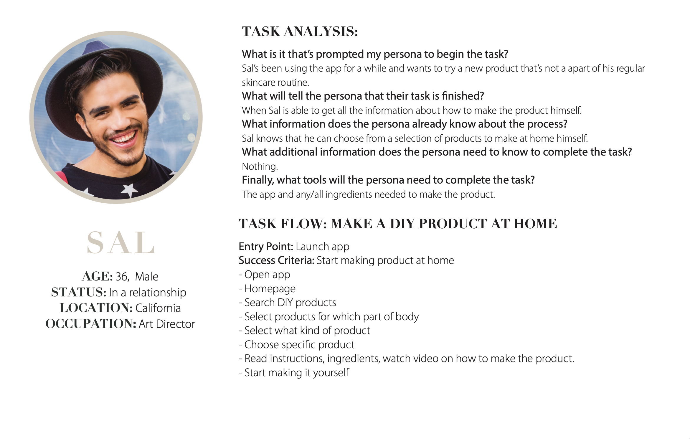
All tasks are now finalized thanks to my personas, mental models and user journeys but now i need to make the usability of each task perfect. In order to do that i created task analysis and user flows for each task so that i can really push my UX skills to the next level. These steps served as the starting point to map out the information architecture for Skin Concierge.
information Architecture
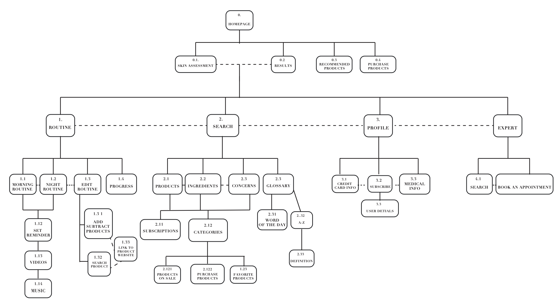
With the User flows executed beautifully for each task i could now begin tirelessly and extensively working on the information architecture of the app by building a site map which i reworked several times over the course of the next several days to improve the IA as much as possible.
Low Fidelity Wireframes
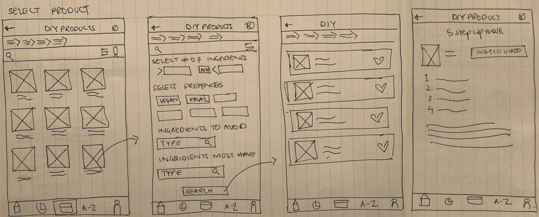
After reworking the sitemap several times i was able to successfully develop a final version that exceeded the expectation of the users. This milestone gave way to the starting point of another fun aspect of UX design: Wireframes! First i took a pen and paper ( my favorite for low fidelity wire frames) and i sketched out hundreds of wireframes. It was fun, it was tedious , it was informative and it was rewarding because after drawing hundreds i was able to draw a handful that began to stand out amongst the others as the most successful ones
Mid Fidelity Wireframes
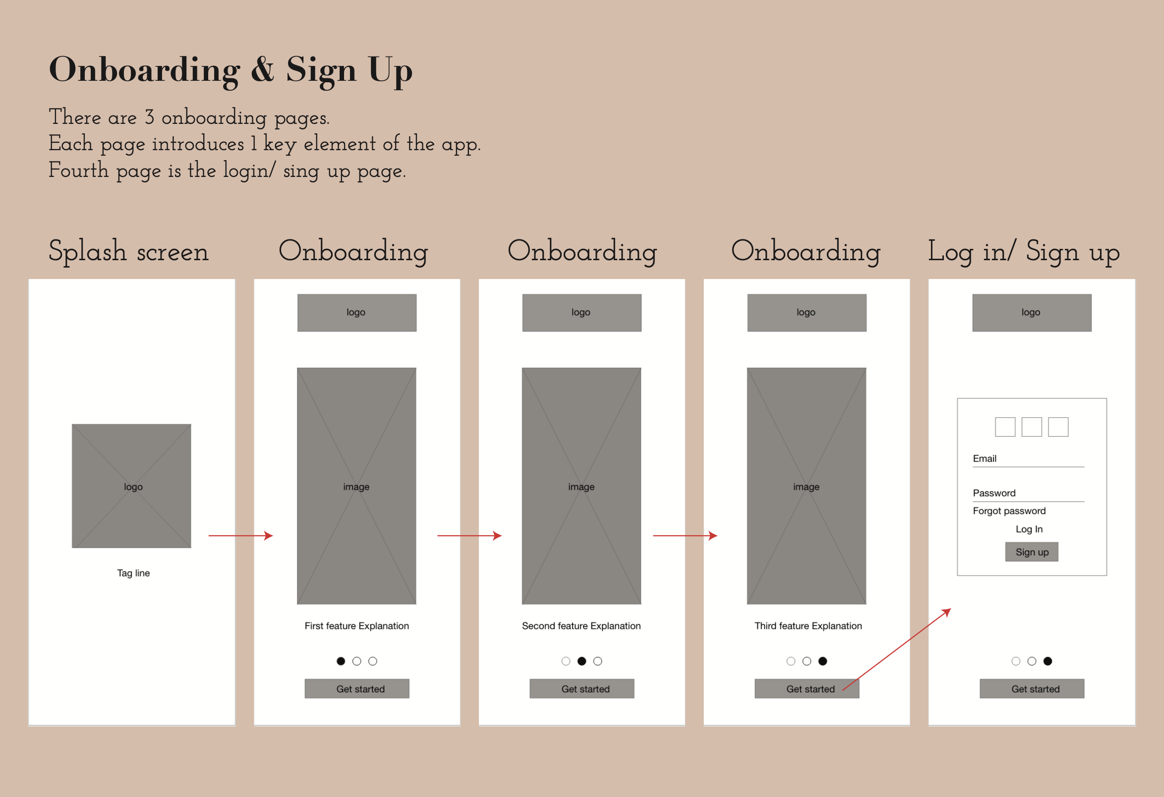
Next, I brought my pen and paper sketches onto my screen and transformed them to mid fidelity wireframes to have a clear idea about layout, user experience and spacing. I also developed a prototype for my mid fidelity wireframes.
Usability Testing and A/B Testing
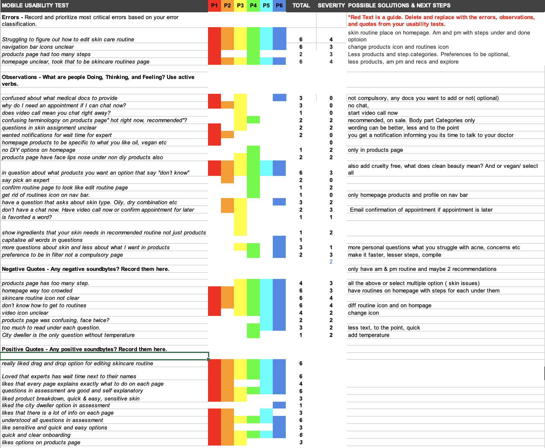
After months of it just being me and my personas it was time to take the app back to the real users and test it out. i test my prototype on 6 participants all from different backgrounds, ages, career paths etc. The interviews were moderated remote tests. Next i conducted an A/B test on a few screens to help understand what works better for my target audience. Then i gathered all the data that i collected through the tests and created a detailed affinity map. This helped me understand the strengths and weakness of the experience thus far. It helped me understand what problems were present and how to solve them. Also the intensity of each problem.
High Fidelity Wireframes
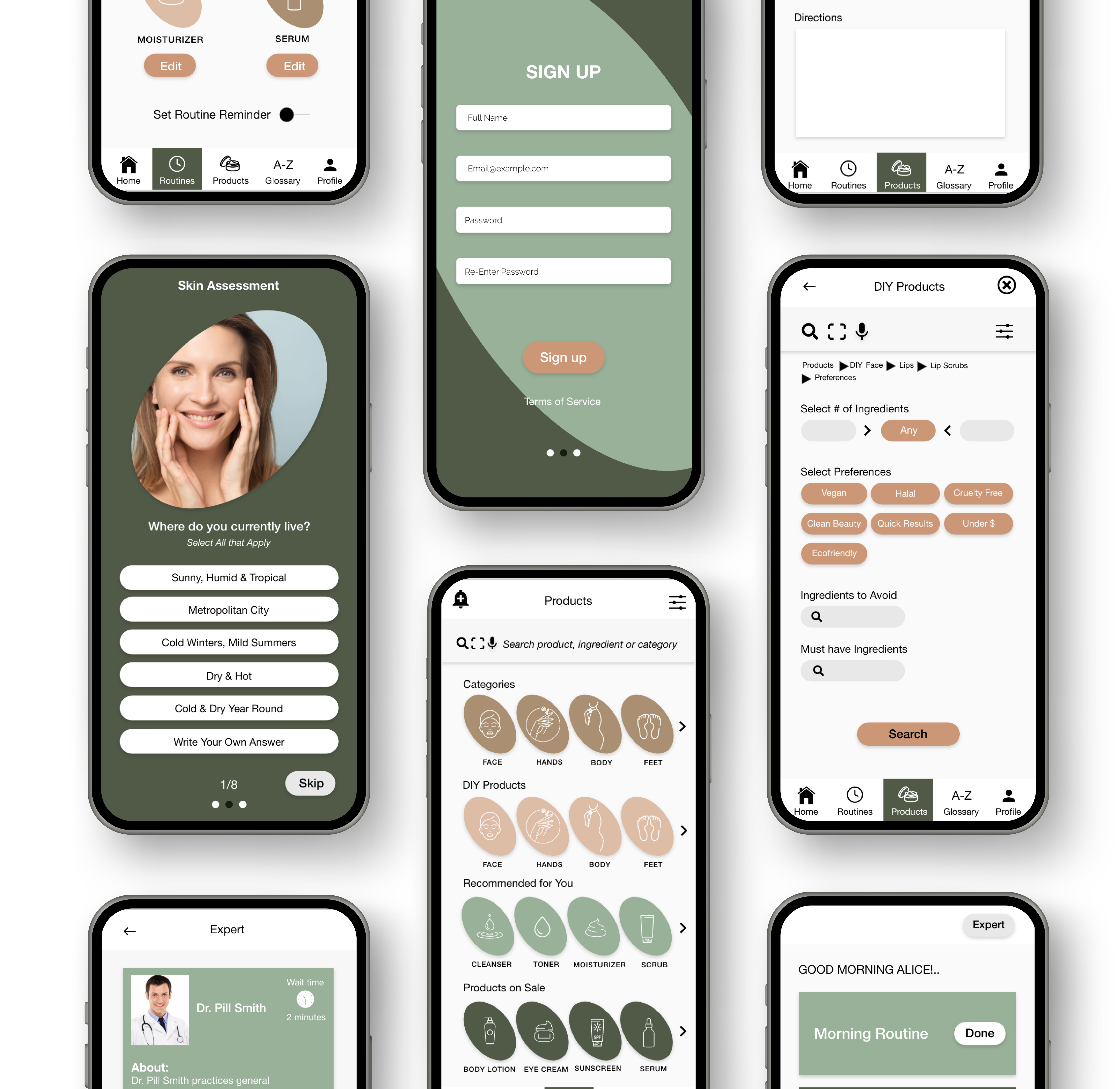
Last but not the least, i took all the information i gathered from my affinity map and designed my high fidelity wireframes which were significantly better than my mid fidelity wire frames and the reason for that was conducting the usability test. I also created a prototype for my high fidelity wireframes. Note: The app was designed for mobile and website but the process on my website is only shown for mobile.
